
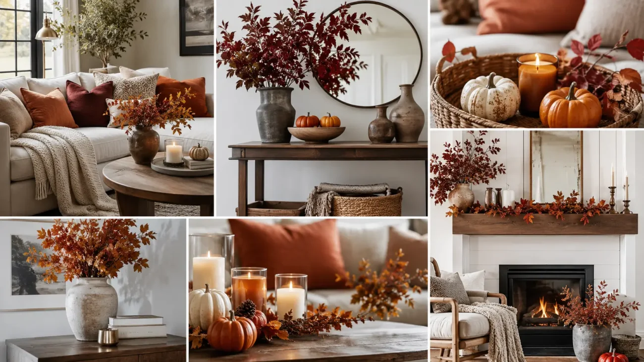
Fall room decor feels most convincing when warmth comes from color, fabric, light, and useful objects rather than a crowded collection of seasonal signs. Clove brown, dusty lilac, oat, tobacco, muted blue, and soft pewter create a balanced palette that works with modern and traditional furniture. The six ideas below explore unexpected color, enveloping doorway curtains, tortoiseshell pattern, block printed linen, quiet metal glow, and tiled accent furniture.
Clove Brown and Dusty Lilac for Unexpected Autumn Color
Clove brown creates depth without feeling as heavy as black, while dusty lilac brings a soft cool note that keeps the room from becoming overly earthy. Use brown across one substantial area, then repeat lilac through smaller textile accents so the contrast feels intentional.
Paint the Inside of Shelves in Clove Brown
Refresh a bookcase, cabinet niche, or open shelving unit with a deep clove shade. Pale ceramics, books, and glassware will stand out against the darker background. Keep the outer frame in wood or warm cream so the brown remains contained. A satin surface will reflect enough light to prevent the shelves from looking flat.
Add One Dusty Lilac Mohair Cushion
Place a soft lilac cushion on a cream, camel, or brown chair where its cooler color can interrupt the warmer palette. Mohair or brushed wool adds a misty surface that changes under evening light. Choose a simple shape, then repeat lilac through a book cover, artwork detail, or small vase.
Unite Both Shades With an Oatmeal Rug
An oatmeal rug creates a calm base beneath clove furniture and lilac fabric. Look for visible weave or gentle tonal variation rather than a perfectly smooth surface. The lighter floor area will keep darker accents balanced and make the room feel open. Position furniture partly on the rug so the seating area feels connected.
Portiere Curtains That Make Doorways Feel More Inviting
A portiere is a substantial curtain placed across a doorway, creating softness, privacy, and a sheltered feeling between rooms. Choose wool, lined linen, or dense cotton in a color already present nearby, then keep the gathering controlled so the fabric never blocks movement.
Hang a Wool Panel Across a Wide Opening
Install a sturdy rod above a doorway and hang one generous wool panel that can draw fully to the side. Moss, tobacco, muted blue, or deep plum can bring seasonal depth without requiring wall paint. Allow the fabric to stop just above the floor so it remains neat. Simple rings will make the panel easy to move.
Finish the Edge With a Contrasting Band
Add a broad vertical band in cream, rust, or dark brown along the leading edge of the curtain. The contrast will define the doorway when the panel is open and add tailored detail when it is closed. Repeat the band color through a nearby cushion or lampshade.
Use Different Colors on Each Side
Line the curtain with a second color that belongs to the adjoining room. One side might show clove brown while the other reveals muted lilac or soft blue. Choose fabrics of similar weight so the panel hangs evenly without twisting.
Tortoiseshell Accents for Glossy Collected Character
Tortoiseshell pattern combines amber, caramel, espresso, and black in an irregular surface that feels warm and layered. Use imitation or printed finishes rather than natural shell, and repeat the pattern through only two or three pieces so every accent remains noticeable.
Frame a Small Landscape in Tortoiseshell Pattern
Choose one intimate landscape, portrait, or abstract print and place it inside a patterned frame. The amber markings will bring warmth to pale walls and connect naturally with walnut or oak furniture. A cream mat will provide breathing room around the artwork.
Place a Patterned Box on the Coffee Table
Use a lidded decorative box to store remotes, matches, chargers, or small daily items. Set it beside a plain book stack or low ceramic bowl so the glossy pattern receives enough space. A rectangular shape feels tailored, while a rounded box brings a softer mood.
Add a Tortoiseshell Base Beneath a Linen Shade
A lamp with a mottled amber base can bring subtle movement to a reading corner or side table. Pair it with a plain linen shade in cream or oat so the base remains the focal point. Warm light will deepen the caramel markings after sunset. Keep nearby accessories matte to create contrast with the polished surface.
Block Printed Linen for Handcrafted Pattern
Block printed linen introduces pattern with slight irregularity, giving a room a more relaxed and personal feeling. Small leaves, curved vines, seed shapes, and abstract marks work beautifully in muted indigo, paprika, olive, or brown. Choose one print family and vary its scale instead of mixing several unrelated patterns across the room.
Dress a Window With a Gathered Linen Valance
Use a short gathered valance in a small botanical or geometric print above a plain curtain or uncovered lower window. The fabric adds color near the ceiling without darkening the entire room. Select a pattern with generous background space so the folds remain visible. A wood or dark metal rod will ground the softer linen.
Slipcover a Small Stool in a Larger Print
Cover a footstool, vanity seat, or compact ottoman with a larger version of the same block print. Position it near solid upholstery so the pattern can stand out. Piping in brown, indigo, or olive will sharpen the outline and make the piece feel finished. A removable cover also makes the seasonal change easier to clean and store.
Wrap Books in Coordinating Printed Paper
Cover a few decorative books or storage boxes with paper inspired by the linen pattern. Keep them on a shelf or console near the printed fabric, but change the scale so the repetition does not look exact. Limit the group to three items and stack them unevenly. This small detail carries the pattern into another part of the room.
Pewter Glow for Quiet Autumn Evenings
Pewter brings a soft gray metallic note that feels calmer than bright silver and cooler than brass. Its muted surface works beside dark wood, cream fabric, clove brown, and smoky blue. Use hammered, brushed, or aged finishes so the metal catches light gently. A few substantial pieces will create more impact than many tiny accents.
Center a Hammered Tray on an Ottoman
Place a wide pewter tray on a fabric ottoman or coffee table and arrange one candle, a small bowl, and a closed book inside it. The raised edge keeps the grouping practical, while the hammered surface reflects light in small broken highlights. Leave part of the metal visible and keep the arrangement low enough for conversation.
Pair Tall Candlesticks With Short Pillar Lights
Combine two slender pewter candlesticks with one shorter battery pillar light on a mantel or sideboard. Varying the height creates rhythm without requiring a large display. Use cream candles for a traditional mood or deep brown for stronger contrast. Keep the pieces separated so their individual shapes and shadows remain clear.
Hang a Pewter Plate Above a Console
Display one embossed or hammered pewter plate as wall decor above a narrow table. Its circular shape can soften a room filled with rectangular furniture and frames. Place a shaded lamp below so evening light reveals the surface. Avoid surrounding it with many metallic pieces, allowing the single plate to feel sculptural.
Tiled Accent Furniture With Earthy Glazed Color
Small tiled furniture introduces color, shine, and handcrafted geometry through a practical surface. A compact table, plant stand, or tray can bring seasonal depth without changing larger furniture. Choose handmade looking tiles in tobacco, olive, cream, plum, or smoky blue, and use grout that supports rather than sharply outlines the pattern.
Cover a Cube Table in Deep Olive Tile
A tiled cube beside a sofa or chair can hold a drink, book, or small lamp while adding solid color. Deep olive feels grounded beside cream upholstery and brown wood. Use slightly varied tiles so the surface has movement. Rounded tile edges and sealed grout will make the piece easier to use and maintain.
Build a Checkerboard Tray in Muted Tones
Create or choose a low tray with a checkerboard of cream and tobacco, dusty blue and brown, or lilac and clove. The pattern brings order without feeling overly graphic when the colors remain muted. Place it on a dining table or console and keep the objects inside simple. Two cups or one vase will allow the tilework to remain visible.
Add Glazed Tile Beneath a Plant Stand
Top a small wooden plant stand with one broad ceramic tile or a group of related tiles. The glazed surface protects the wood while adding a rich color beneath the pot. Choose a plant with deep green leaves and a plain container so the base receives attention. This detail works especially well near a window or in an empty corner.
Make Every Room Feel Warmer Before the Season Fully Arrives
The best fall room decor creates comfort through details that belong naturally with the home. Clove brown and dusty lilac offer unexpected color, while doorway curtains make adjoining rooms feel more sheltered. Tortoiseshell accents add glossy character, block printed linen brings handcrafted pattern, and pewter creates a quiet evening glow. Tiled furniture finishes the space with practical color and texture.
Choose one larger change and one smaller accent, then repeat their shades in nearby rooms for a connected result. Related inspiration for fall living rooms, autumn bedrooms, seasonal entryways, cozy lighting, dining room styling, and mantel decorations can help the whole home feel welcoming without making every space look identical.
